Tuesday, 5 May 2015

Moderator Note

Hello Moderator,
 
Below, beginning from September, you will find my 'Research & Planning' posts. You will then find my Evaluation posts (1-7), and also my completed product - my music magazine.
I have attempted to present my blog in a neat and organised layout, so that it is easy for you to read and understand information promptly.
 
I hope that you enjoy scrolling through my blog and that it's worth your while!!
 
Many thanks,

Shafia. 

Monday, 4 May 2015

FINAL MAGAZINE


THIS IS MY FINAL MAGAZINE. FRONT COVER, CONTENTS PAGE AND DOUBLE PAGE SPREAD. 


Tuesday, 21 April 2015

EVALUATION 7: Looking back at your preliminary task, what do you feel youhave learnt in the progression from it to the final product?


In this ISHOWU video, I have discussed what I have done over the course of the year by learning new skills within media. I have talked about my preliminary magazine and my music magazine. I have talked about the camera I used for both, the photography, font, genre and the layout of my magazine. 

Friday, 17 April 2015

EVALUATION 6: What have you learnt about technologies in the process of constructing this product?


Above is a Canon DSLR camera. This is the camera that I used to take my photographs for my magazine. The camera has many settings that I have never come across before using it. It took me many attempts to get used to it and then use it without help. A particular setting that was extremely helpful was 'AutoFocus', that's because I shake a lot whilst taking photos. When I was taking the photographs, I struggled to get a HD result without this setting on the camera because everytime I didn't have this feature on, then photo would come out blurry. It gives it a good finish to it and makes it look much more better than the iPhone photos. 

I used a programme called 'IShowU' to demonstrate how I used different technological software's such as:
-Photoshop
-InDesign
-Blogger
-Prezi
-PowerPoint/Slideshare
-iPhoto
-Flickr
Below I have done an ISHOWU to demonstrate the different technologies I have used over the course of the year and how I have developed my skills with some programmes. 


Monday, 13 April 2015

EVALUATION 4: Who would be the audience for your media product?


Name: Henry Kudrow
Gender: Male
Age: 17
Occupation: College/Sixth Form Student

Favourites:
Film: The Lord Of The Rings, Two Towers
TV Show: Sherlock
Book: Hunger Games Trilogy
Music: Oasis & All Time Low
Songs: Secrets, Stole & Gone
Genre: Indie, Rock, Punk
Social Media: Instagram, Facebook and Twitter


Henry is a 17 year old college student studying Media as a full course. He loves going to gigs and staying with the new band updates. Henry enjoys taking photos and does this as a hobbie along with reading and playing the piano. Henry wishes to study media next year at university and hopes to 
I bcontinue with his love for bands. He loves to buy the new merch bands put out and regularly visits the local HMV and Pulp store. He enjoys discovering new indie/rock bands and always goes to the meetups that they have.


My target audience would fit this profile and be someone like Henry because this is a typical type of person who's "indie". My target audience would fit this profile as most fans of bands do attend concerts and are updated with the upcoming bands and merchandise. 

Henry would be interested to buy my product because of all the things have been listed above and would be interested in what the magazine has to offer to him. 

I believe that my target audience would be in the working class or middle class. I have made my magazine to sell at £2.00. This would be affordable for both working class and middle class. The working class would be unable to buy a magazine which is too expensive so making it this price would mean they would be able to buy the monthly edition from pocket money. 

Wednesday, 8 April 2015

EVALUATION 2: How does your media product represent particular social groups?


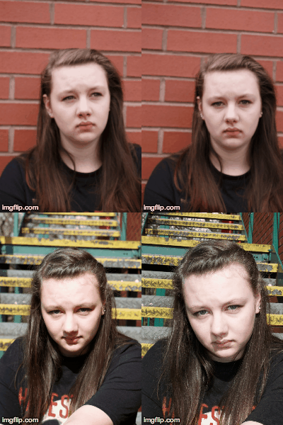
This is a gif which just shows some of the similarities and differences in the photos of existing magazines and my magazine. In this, I show two photos of Megan and another model. The photo of megan is similar to the existing photo because of the facial expression. Megan doesn't have a facial expression and she looks like she is neither happy or sad. This adds to the theme of being indie. The posture is also similar because it is two different. The first image shows Megan slightly turned to the right and this is similar to the existing magazine photo. 
There is no actual gesture in the photos but they do give out an effect. It almost looks like they are both angry but it still doesn't make them look moody. The angle which the photo has been taken is effective because it shows their face completely but it shows some attitude. The image looks good because it emphasis the emotions of the model. The shot type of of the photo is the same, a medium close up. I think that this is effective because it shows some of the posture and most of the emotions of Megan. The hair from both the images are different because in the real image, one model has her hair tied up whilst my model has her hair down. Having her hair down meant that it has a sense of femininity to it. Although I used a different image for my front cover which doesn't have her hair down, I thought about using this one too but I thought this looked a bit too pop rather than the indie genre. 
The lighting used is effective because in the real magazine front cover, the light focusses on the models's nose or mouth area. In my shot, however, it focuses on her entire face. I thought that this was important to do because otherwise, the emotion of the model wouldn't be coming out, portraying that it is an indie magazine. The costume isn't really shown and I thought that this was a downer because it could have been telling us more about the genre of the magazine. I think that the costume of the real model is more seen and it makes it better than my photo because by the simple collar shows what type of music she's into. 


This is an example of another magazine and my magazine merged together. Here I will explain what I have already done above but more in depth. The genre of both shows that they are both indie magazine. This is through the photo and the font that has been used. The Lula magazine has the simple, fancy font for the masthead whilst my magazine has the simple bold font. Indie magazines often have simple mastheads because then it doesn't look heavy unlike the rock magazines such as the NME magazine or KERRANG. The lighting used in Lula looks good because it it focusses on the face. The background has been blurred and this adds to the effect because then it makes the face of the model more laminated. The lighting on my magazine is different because although I have made her face more seen, it still kind of shows the background. The brick wall in the background adds to the theme of the indie music as it is conventional for "hipsters" to be hanging around in these types of areas. The stereotypes which are associated with the indie people is having parkers, vans and the hoodie fashion. This has been illuminated with my magazine as you can see with my model having a parker on her. I liked the idea of having the grey colours. This was due to it being a simple colour but still light and not the dark heaviness adding to a rock theme rather than the indie. 
The angle for both magazines are the same. This was the simple front shot. I thought that this was a good idea, although simple, because it could then focus on the emotions and the actual model than the way that they are placed. I thought that the idea of having the simple angle would also show what type of person they are. 
The shot type is a medium close up for  both magazines. This was the required image type so I have used this. It was a good idea to do this because then it could focus on the way that they are dressed but also their face and maybe the background. The medium close up was also a good idea because of these reasons and it is also the normal magazine shot. -


Sunday, 5 April 2015

EVALUATION 1: In what ways does your magazine use, develop or challenge forms and conventions of real media products?


This is a mini powerpoint of my evaluation question 1. Here I have discussed about how my magazines uses, develops and challenges other magazines. I have gone over some points such as the colour scheme, layout and the style of the magazine. I have used KERRANG and INDIE as my example magazines to compare.


This is the magazine I compared my magazine to. I thought that this was a good magazine to compare my magazine with because I analysed this in my audience research as well as it being a really big indie magazine in the music industry. There was easy comparisons and differences to make with my magazine and I thought that by using this magazine to compare would help me see how successful I have actually been in completing my indie magazine. 


I used this KERRANG contents page to compare my magazine with the real one. I thought that this was a good idea because I could see good similarities and differences in my magazine such as the layout and the font. By talking about the using, developing and challenging factors of my magazine, it allowed me to easily do the question. 


Friday, 6 February 2015

Research And Planning: Contents Cont.

Today I have completed more of my contents page.  Here I added more to the bar & information. I also added another guide to make the writing more in proportion and to look more neater than it previously did.

Tuesday, 3 February 2015

Research And Planning: Contents Page Cont.


Today I have completed more of my contents page, adding further to the side bar but trying to rearrange the contents around. I thought that this would be fun to play around with. 
I remove the big editors note because I found that this took too much space on the contents page and that I didn't have much to say in the note anyway so I added a bit more detail with the side bar extending it and put the note changed into a competition. 

Friday, 23 January 2015

Research And Planning: Contents Page Cont.


Here is a photo of my contents page as a whole. Today I did a great deal on the contents page adding a editors note onto the page. I also made the "In Music" stand out a big more by adding a shadow to it. I highlighted the font "Contents" and added two different shades of grey boxes for the editors note. 
A bit of a close up of the actual page here. The editors note has a clear colour code. I thought that putting it below here would make it stand out a bit more and look more easier for the reader to read as done in my research. 

Thursday, 22 January 2015

Research And Planning: Front Cover Update


So, this is my completed front cover! I think it looks really interesting and I have played around with the fonts really well. It meets all the needs of the criteria and I'm rather happy with the end result. 

Wednesday, 21 January 2015

Research And Planning: Contents Page Cont.


Here I have played around with the contents page and added more to the side bar but made it the same thing over and over again. I did this to see how it would look. I will change the colour of the font after adding the information needed.

Research And Planning: Contents Page Cont.


Sunday, 18 January 2015

Research And Planning: Double Page Cont Update

For my double page spread so far I have added the main things needed but I also still need to do further research on audience and get more feedback from social media. I also need to find a suitable font for my cover and make it appealing to look at yet different.

Friday, 16 January 2015

Research And Planning: Double Page Cont.

Today I have worked further with the double page spread story and have added more detail with the story.

Tuesday, 13 January 2015

Research And Planning: Double Page Spread

Double page spread. I have added boxes for my text to go onto. I have also resized the image to go all on my second page. I have named the title "my crazy life" in bold font. I have started writing my main story.